We’ve all seen pie charts, bar graphs, histograms and many other ways of representing data. They belong to the “Diagram” world, and are used to represent information in an more visual and orderly manner. It can get boring to look at them, but no one doubts that they’re extremely helpful when you have to arrange a lot of information in a way that people can understand it.
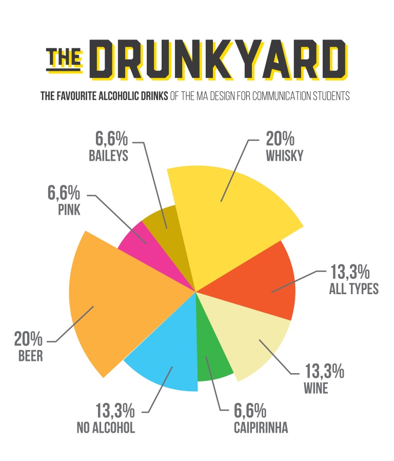
For my Design Research Methods class I had to create a diagram representing data collected from my classmates. Such information could be our age, our favorite brand or where we live. I chose to describe our favourite alcoholic drinks, because who doesn’t love alcohol? Well, according to the data collected, 13,3% of my classmates don’t.
 I used a pie chart because they’re great when describing percentages. In this case, I assigned colors to each piece of the pie so it didn’t look so monotonous.
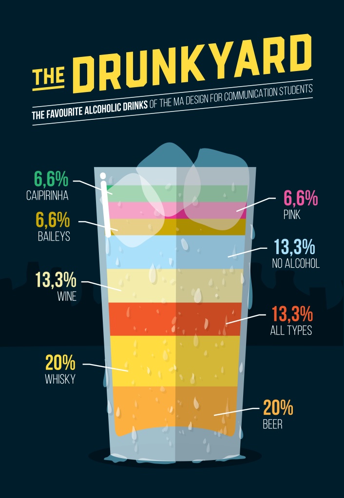
This is a very standard and straight-forward way of representing data through graphics, but who says that you can’t get creative from time to time? Just for fun, I did another diagram, but in a whole different way. Inspired by an infography that I saw some time ago that shows how to make cocktails (http://www.visualnews.com/2011/02/01/perfectly-mixed-an-infographic-of-fancy-drinks/), I decided to represent the percentages in a sort of horizontal-bar-graph style but in a more creative approach.
Different colors and bar sizes make the information more fun to read and it’s still understandable, although if you mixed all those drinks in one glass, as the diagram above, you would probably quit alcohol right after the first sip. To conclude, it all comes down to how you want or need to represent the information without making it chaotic or hard to understand.

